Creating a chart/graph in Excel
Patterns and relationships between numbers are often easier to recognise when they are displayed in chart (graph) form.
Chart type
Before selecting the data you wish to graph, it’s helpful to have an idea of what chart type would best display your data. The type of data and the nature of the investigative question often determines the chart type.
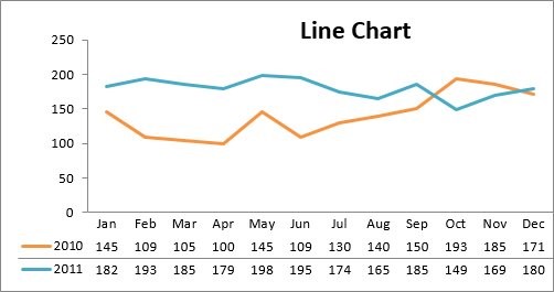
Line Chart
e.g. changes in sales over time.

Column Chart
Ideal for comparison of single category data between individual sub-items.
e.g. when comparing revenue between regions.

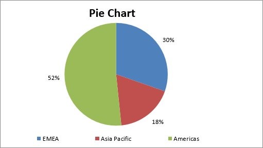
Pie Chart
Represents the proportion of each data type of the whole.

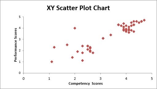
XY Scatter Plot Chart
Used to show correlations between two sets of values i.e. how the change in one variable is related to change in the other variable.

Make your chart in Excel & refine
Select the cells that contain the values you want to be shown in the chart. Click and drag the cursor from the top left cell to the bottom right cell of the worksheet – including column and row headings when possible.
- Click the Insert tab.
- Click the Chart Type from the Charts section of the ribbon. The sub-type menu is shown.
- Click the desired chart sub-type. The chart appears on the worksheet.
- When the chart is selected the Chart Tools Menu appears. Changes to colour, formatting and design can be made.
An Excel chart may be placed inside a worksheet next to the data or placed in a separate worksheet. Excel charts can also be copied to other software programmes such as PowerPoint.
To move a chart to a new or different spreadsheet in the same workbook, select the chart, right-click, and select Move Chart. Then choose the sheet or type in a new sheet name and click OK.
The following video shows the process of making a bar chart and how to change its look and labels.


